The ROC-AUC Curve!
Imagine you have a crystal ball that can predict the future with incredible accuracy. Sounds awesome, right? But how do you know if your crystal ball is as good as it claims to be? That’s where the ROC curve comes in.
Introduction
The Area Under the Curve (AUC) of the Receiver Operating Characteristic (ROC) curve is a widely used evaluation metric in machine learning and statistical modeling. But AUC-ROC is more than just a fancy acronym — it’s a powerful tool for evaluating the performance of models, and it can help you understand how well your model is able to distinguish between positive and negative cases. The ROC curve is not only informative, but also visually stunning, with its characteristic shape and shading that make it a pleasure to look at. Whether you’re a data scientist, a machine learning enthusiast, or simply curious about the power of AUC-ROC, you’re in for a treat! Get ready to dive into the world of AUC-ROC, where data meets beauty!
The term AUC-ROC, and ROC-AUC mean the same thing, and I would use them interchangeably. This article will go over the ROC-AUC in detail, including how they are constructed and evaluated, how they may be used to evaluate the performance of a classification model, as well as a step-by-step walk-through of the entire process.
Preamble: In my last article, I explained the fundamentals of Performance Metrics, and this article will expand on that. If you haven’t already read my previous article on Basic Performance Metrics, I strongly advise you to do so before continuing.

Propensity Chart / ROC Curve
A propensity chart, also known as a Receiver Operating Characteristic (ROC) curve, is a graphical representation of a binary classifier system’s performance. It compares the true positive rate (TPR) against the false positive rate (FPR) for various threshold values. I have already discussed about these metrics in my previous article, before proceeding any further I recommend you to check them out if these terms are new to you. The TPR represents the proportion of true positives that are correctly identified as such, whereas the FPR represents the proportion of true negatives that are wrongly categorized as positives.
Fun Fact: ROC (Receiver Operating Characteristic) analysis was first developed during World War II to evaluate radar signal detection performance. The concept was later adopted in the field of medicine and other areas to evaluate diagnostic and predictive models.
Welcome to the magical world of ROC curves!
ROC-AUC is a powerful tool for evaluating the performance of predictive models, allowing you to measure their accuracy and identify the best threshold values for predicting outcomes.
Create a ROC Curve in Six Easy Steps:
- First, gather your model’s predicted scores and true labels.
- Then, sort the predicted scores in descending order
- Establish the range of possible thresholds.
- Calculate the true positive rate (TPR) and false positive rate (FPR) for each threshold value
- Plot the resulting points on a graph with TPR on the y-axis and FPR on the x-axis. As you move from left to right on the ROC curve, the threshold decreases, indicating that more observations are rated as positive.
- The area under the curve (AUC) represents the overall performance of your model, with 1.0 signifying a perfect classifier and 0.5 suggesting a random classifier.
Example Walk-Through
Let’s take an example and try to understand these steps in details. In this example, we shall use a random classification model to classify whether a book will be a best-seller or not. The observations are probabilities if it will be a best-seller — positive (‘1’) or not so — negative (‘0’). Here our objective is to understand the evaluation criteria in detail, so we will not go deep into model selection and assume any random model to produce the outputs.
Step 1 — First we take a dataset of 30 observations, which provides us the model’s prediction scores or probabilities (predicted_scores) and the true labels (actual_labels).
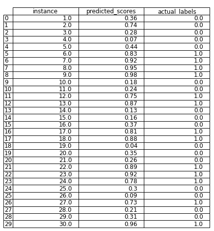
Step 2 — Now we will sort the dataset based on the predicted_scores column in descending order.

Step 3 — Now, we will select some threshold value. For this example if we select a threshold of 0.33 — any observations with scores below this threshold will be categorized as negative (‘0’) class and all observations greater than or equal to this threshold will be categorized as positive (‘1’) class. This is denoted by the ‘threshold’ column below.

Step 4 — Now, we will calculate the TPR or Sensitivity (True Positives / Total Actual Positives) and FPR or (1-Specificity) (False Positives / Total Actual Negatives) for each threshold. The more thresholds you select, the more refined curve you shall get. For the sake of simplicity, we shall use only 30 evenly spaced thresholds between [0,1], and calculate the TPR and FPR varying the threshold as in the previous step.
Step 5 — Now, using these set of TPR and FPR values, we will plot the ROC curve with Sensitivity or TPR as the Y-axis, and (1-Specificity) or FPR as the X-axis. We shall also include a baseline (naive) classifier (denoted by the red dotted lines). If our model is near or below this baseline, we shall consider our model to have really bad performance.
Step 6 — Finally, we will calculate the Area under the ROC Curve (AUC) using numerical methods such as the trapeziodal rule (numpy.trapz or scipy.integrate.trapezoid). If we have a good model, the AUC should be near to 1, and if the AUC is below 0.5, we will know that our model’s performance is worse than a random guess (baseline). We will plot the AUC as well.

We can notice, that the performance of our model was good, as the ROC curve is more towards the upper-left corner of the plot, indicating a high TPR and a low FPR. We can also justify this with the fact that we got a AUC value of 0.9955, which would be very close to an ideal classifier (AUC=1.0)
Key Insights from ROC-AUC Curve
Here are some of the key-insights you can derive by looking at any ROC-AUC curve:
- The closer the ROC-AUC curve is to the top-left corner of the plot, the better the model’s performance. This indicates that the model is correctly predicting a high percentage of true positives while maintaining a low false-positive rate.
- An AUC of 0.5 suggests that the model’s predictions are no better than random guessing. An AUC of 1.0, on the other hand, indicates that the model is perfect at discriminating between positive and negative examples.
- The ROC-AUC curve is a helpful tool for selecting the best threshold value for classification. By looking at the curve, you can determine the optimal tradeoff between sensitivity (true positive rate) and specificity (true negative rate) for your particular problem.
- The ROC-AUC curve can be used to compare the performance of different models on the same task. The model with a higher AUC is generally regarded as the better performer.
- The ROC-AUC curve can also be used to evaluate the quality of probabilistic predictions. A model that produces well-calibrated probabilities should have an AUC close to 1.0.
Comparing ROC-AUC for various classifiers
Here, we will compare the ROC-AUC curves for three types of classifiers —perfect, moderate, worse classifiers, and see how they differ from one another.
Perfect Classifier
A perfect ROC-AUC curve has a TPR of 1 and an FPR of 0. This means that all positive examples were correctly identified by the model, and none of the negative examples were mistakenly labeled as positive. A perfect ROC-AUC curve is one in which the classifier perfectly separates the positive and negative classes without any overlap, giving an AUC score of 1. This means that the model is a great classifier and can perfectly tell the difference between the two classes. This is the best case, but it doesn’t happen very often.

Moderate Classifier
A moderate ROC-AUC curve usually has a TPR that is less than 1 and an FPR that is greater than 0, but it is still better than random chance. This means that the model gets more positive examples right than negative examples right, but there are still some wrong classifications. A moderate ROC-AUC curve is one in which the positive and negative classes overlap, giving the classifier an AUC score between 0.5 and 1. This shows that the model can tell the difference between the two classes to some degree, but it could still be better.

Worse Classifier
A worse ROC-AUC curve has a TPR that is not much better than random chance and an FPR that is very high. This means that the model is not working well and is misclassifying a lot of positive and negative examples. A worse ROC-AUC curve is one in which the positive and negative classes overlap a lot, giving the classifier an AUC score of less than 0.5. This means the model can’t tell the difference between the two classes and is worse than a random classifier.

It’s important to note that the ROC-AUC curve is just one evaluation metric for classification models, and it’s important to consider other metrics such as precision, recall, accuracy, and F1 score to fully evaluate the performance of a model. However, the ROC-AUC curve is a useful tool for visualizing and comparing the performance of different classifiers.
Some Applications of AUC-ROC Curve
Although we utilized a classification model, there are several circumstances when AUC-ROC can be adapted for use in regression models. In some cases, a regression model may produce a probability that an event will occur, and the threshold of this probability sets the predicted value. In these situations, AUC-ROC can be used to evaluate the model’s performance. It should be noted, however, that this is not a common approach and may not be suited for all regression problems.
- Medical diagnosis: AUC-ROC can be used to figure out how well a model for medical diagnosis works. For example, if you want to predict whether a patient has a certain disease or not, you can use AUC-ROC to measure how well the model can correctly identify patients who have the disease and avoid giving false positives.
- Credit risk analysis: In credit risk analysis, AUC-ROC can be used to measure how well a model predicts how likely it is that a borrower will not pay back a loan. A high AUC-ROC score shows that the model is good at telling the difference between borrowers with high risk and those with low risk.
- Detecting fraud: AUC-ROC can be used to measure how well a fraud detection model works. For example, AUC-ROC can be used to figure out how well a model can spot fraudulent credit card transactions while reducing the number of false positives.
- Marketing campaigns: AUC-ROC can be used to measure how well a marketing campaign is doing when it’s aimed at a certain type of customer. For example, in email marketing, AUC-ROC can be used to measure how well the campaign is able to correctly identify customers who are likely to make a purchase and avoid targeting customers who are not likely to make a purchase.
- Image recognition: AUC-ROC can be used to measure how well a model works at recognizing images. In the case of medical image analysis, for example, AUC-ROC can be used to measure how well the model can find abnormalities in images while reducing the number of false positives.
Conclusion
In conclusion, ROC-AUC curves are an essential tool in evaluating the performance of classification models. The curve provides a visual representation of a model’s ability to distinguish between positive and negative classes, and the AUC score summarizes its overall performance. A perfect ROC-AUC curve would have a TPR of 1 and an FPR of 0, while a worse curve would be indistinguishable from a random classifier. It is crucial to consider the ROC-AUC curve and AUC score when selecting the best model for a given problem. With this powerful tool, we can confidently choose the model that maximizes performance and minimizes errors, making it an essential tool in the field of machine learning.
Reference:
- Chou, S.-Y. (2019) AUC — Insider’s Guide to the theory and applications, Sin. Available at: https://sinyi-chou.github.io/classification-auc/ (Accessed: February 20, 2023).
About Author
Debanjan Saha, a.k.a, “Deb”, is a data enthusiast with a background in Data Engineering from Northeastern University in Boston. With over 5 years of experience in the field, he has developed a deep understanding of various data-related concepts and techniques. Passionate about turning data into insights, he has helped many organizations optimize their operations and make informed decisions. As a Data Scientist, he has successfully led projects involving data analysis, visualization, statistical modeling, and model deployment. His skills include proficiency in Python, Matlab, PySpark, Computation, Optimization, and Azure Databricks, among others.
When not working with data, Deb enjoys listening to music and playing guitars. He is also a frequent contributor to online communities, sharing expertise in the form of articles and tutorials on platforms like Medium. To learn more about him and stay updated on his latest work, you can connect with Debanjan on LinkedIn and follow him on Medium.
