Member-only story
Gain, Lift and Decile Charts
Are you struggling to accurately evaluate your classification model’s performance? Don’t fret! Try Gain, Lift and Decile charts to evaluate your model performance.
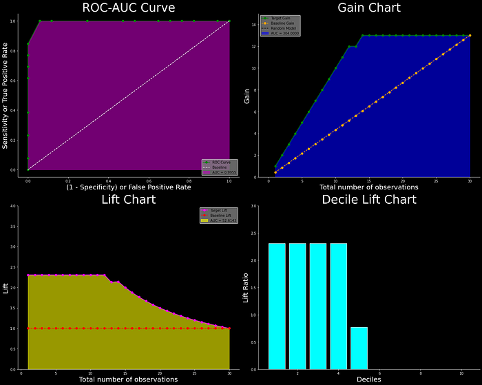
Traditional metrics such as Precision, Recall, Accuracy, and F1-Score can sometimes fall short. That’s where propensity, gain, lift, and decile charts come in. These tools provide a more comprehensive representation of our model’s performance and can help us identify areas of strength and weakness. By utilizing these charts, we can make informed decisions on how to improve our model’s performance. So if you want to take your classification model evaluation to the next level, it’s time to dive into the world of propensity, gain, lift, and decile charts.
This article will go over each of these charts in detail, including how they are constructed and evaluated, as well as how they may be used to evaluate the performance of a classification model, as well as a step-by-step walk-through of the entire process.
Preamble: In my previous articles, I explained the fundamentals of Performance Metrics and ROC-AUC curves, and this article will expand on that. If you haven’t already read my previous article on Basic Performance Metrics, I strongly advise you to do so before continuing.

Imagine that you run a business and want to know how effective your marketing campaign…
